
I agree. Maybe we should drop the +zkSnarks bit. Our main goal is community and joint effort that entails, so the slogan In decentralization we trust makes sense! I don’t know if we need to explain the Z part of our name, but we could right a story about our history and clear it up there for anyone who wants to know more.
Then drop it! I agree with this too.
This sounds good. ZKsnarks is an unusual term, and even digging into what it offers regarding privacy and its application is deep. To throw that term out to you the masses can be a head scratcher.
Or maybe even better and more logical. Bitcoin + zkSNARKs = Btcz
Thanks again for the pro recommendations Mike. Visited your site - nice branding. One thing I caught in your samples is the word ‘decentralisation’ should be spelled ‘decentralization’. The ‘z’
Thanks for the feedback guys. I must’ve automatically written the s instead of z, but that’s not the final guide yet - it’s something that probably needs to be voted in by the core team, as right now it’s just a couple of us sharing ideas and still a lot of people doing very random stuff (often with completely unreadable fonts).
But even that - we should simply say that all -official- communications should use a branding guidelines set, while all non-official (fan made stuff) CAN use it + it’s encouraged but if they want to be “creative” that’s their right.
I can look into creating PSD files for the community to use (kind of like “drop your image here” and change the text)
I’m also pro dropping that zksnarks part as it’s confusing to most real people. It can be communicated as a bullet point where necessary.
The final branding would be like the ones that are linked in the first post (the dropbox links). For now it’s mostly to share the most top-level ideas like the font / backgrounds opacity / safe space etc.
If somebody rally care why the Z in the name they will ask. But I guess “BitcoinZ” is more than enough as the coin presentation.
I don´t like also promisses of the moon.
We must try to reach out the outsiders and I think that the moment to do that is while all the coins are down!!!
We could drop it and then run a campaign about what does “Z” mean to you?
To be honest, I think of World War Z, or the Zombie apocalypse when I hear BitcoinZ. It would be fun to write a story along those lines. “From the ashes of the Great Bitcoin / Bitcoin Cash wars rises a new challenger to the cryptocurrency space. Evolved from the mistakes from the past, BitcoinZ is ready to take on the new world. Yadda yadda yaddda”.
1 Like
I liked the idea to run a campaign about the letter Z, however zkSnarks should be present in the story, just not to forget its origin!!!
Ok, had some crazy work sprints but slowly coming back to life.
The awesome thing is that I’ve already seen some of the usecases (like the post about txtZ) that are following the rules. That also gives me some ideas on what can be improved if we use black text instead of white so I will try and update the document in the next few days.
@renuzit - Manu told me that you’re the person to talk to if we wanted to update the wallet design. I can help with the entire design part (creating every screen and cutting out all the assets) so whenever any of the developers are ready we can try to bump up the wallet quality (not even features, just the actual look and feel). I think that clear branding + a better designed / more beautiful wallet will help a lot to make us more popular 
1 Like
@mikeM Sure, I can help a little but, I’m extremely busy with work stuff and working on BTCZ on the side. The wallet is written in angular and javascript if that helps, but before we go updating the design, we may want to update the wallet to the latest version of copay.
3 Likes
Wallet with all the functions and that design is going to be incredible thanks to all!
1 Like
Ok, I’ll try and rework the current wallet to the new design without adding new features yet while you guys do that newer copay update and we’ll sync when that happens.
I understand more complex features (like a price graph) are more of a future thing, but for now even updating the colors, icons etc can help differentiate the btcz brand.
3 Likes
Just an information providing post about the current btcz logo.
So we have
1)the main circle filling color : #444444 (R:68 G:68 B:68)
2) the z filling color : #42ABCC (R:66 G:171 B:204)
3) The “central” color of the blending golden circle and B symbol : #FACF40 (R:250 G:207 B:65)
It is stepping in linear way, diagonicaly from #FEA600 (R:254 G:166 B:0) to #F8E061 (R:248 G:224 B:97)
2 Likes
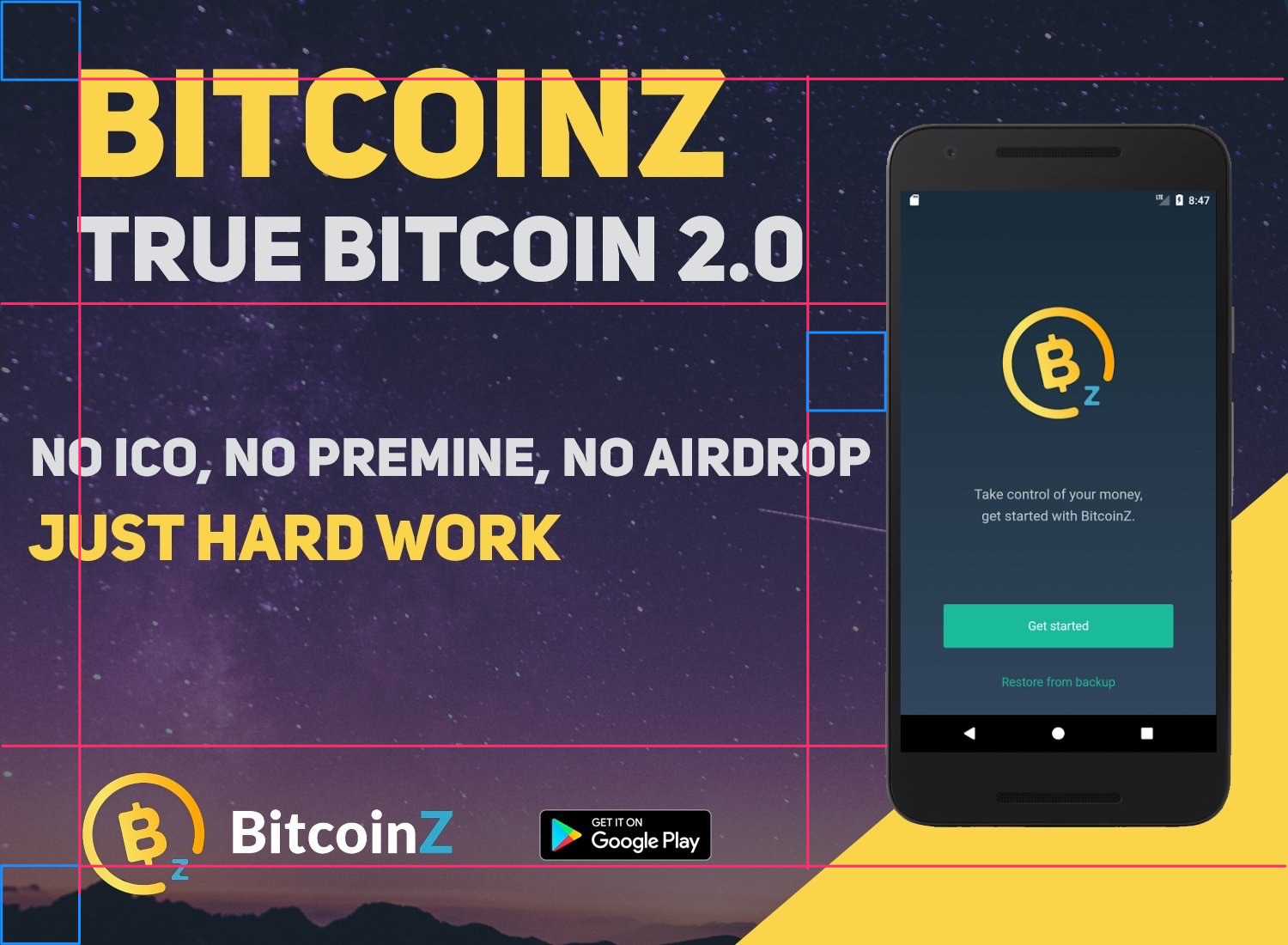
Guys, I’m happy to see there’s improvement in the marketing materials and in general they all are starting to look good now. One thing though is we should still try to enforce a grid on them (added a grid on one of the recent images) for consistency.
So whoever did these - good work, they look nice, but please try to keep within the grid for the future so they’ll be even better
1 Like
Ok. Since we are not doing a redesign / rebranding and proper brand guidelines I think it’s in the best interest of btcz to at least try and stick to those temporary guidelines that I created whenever possible (for OFFICIAL messaging) and keep fan art under a #btczfanart hashtag every time.
I will update this pdf slightly (removing any reference to me from it for one thing) and repost.
Anyone can host it after that? As right now it’s on my personal dropbox. We wanted to do more / better things regarding the guidelines, but committing 100+ hours of my time when the vision won’t be properly implemented just doesn’t make sense to me.
Sticking to those guidelines will result in an improvement. They were temporary but will have to do until someone else proposes something better. Whether it’s enough or not to gain trust of new users time will tell.
You can of course completely disregard it because it’s “community” and do whatever you like with no consequence. So nobody is enforcing it - do what you think is right.
1 Like
this is the right tone and with this tone we must present the proposals, it is a pity that the “crypto police” do not trust the community
This is my last post here. All my points about BTCZ having a scam look are still valid and I hope this will help to turn it around at least a little bit.
I modified the guidelines slightly and added a bit more info here and there.
Feel free to use it as it’s desperately needed.
Also: have you noticed BTCP also has their own txtZ? And their marketing page for it (albeit not that great either) has waaaay more information delivered in a more understandable way? Exactly.
It doesn’t matter who was first, only who people will remember. On btcz side there were only a couple “not so serious graphics” about it without any vision or informative qualities.
Good luck.

friends, who can be at the conference with me? I will be there. Can we hold a presentation there and play the coins? write ideas soon. I already paid a part. may still need a little money. I will call the organizers and talk. write suggestions. My task will be to talk to the directors of the exchanges about listing in a private personal meeting. bold friends! write more ideas, how can I do advertising there bitcoinz Maybe someone will send a t-shirt? You can make business cards stickers of 10 pieces is enough. You can hold a lottery.