
Why it is VERY important to have them
https://docs.google.com/document/d/1vK1NU_TqFuP-GHT_ICY-GsCmWmvRVFKa9cWg1OGF8Ds/
Consistency = trust in new users
Consistant and thought through design is easier to use
Consistant messaging is easier to parse mentally
The problem I’ve noticed is that there are no rules on how to use the logo.
There is a logo but some people put it on one type of background, others on another type and crop it. Others make it pixellated or rotated.
Those actions DILUTE the brand.
Understanding the community driven part, I believe there should be strict rules on how to use the logo unless the goal is to look unprofessional and childish to everyone from the outside world just to keep the community vibe.
Rules don’t “destroy” creativity, they just keep it focused and consistent i.e. logo can only be used on specific brightnesses (only on dark photos for example) and in certain size and spacing from the edge of the image.
We’re talking here about all promo materials like twitter posts / instagram posts (which should be reclaimed as right now it looks like a scam).
LISK
Good inspiration is how Lisk got rebranded (aside of not delivering on their tech related promises) - their new brand / website / marketing is all consistent and makes up for everything else they’re lacking. I’m not saying new LISK is perfect and that everyone should like it. It’s not and people have different tastes. But we can’t deny the entire message around the brand is now consistent.
THIS SHOULD ALSO HAPPEN WITH BTCZ if we want it to succeed. Design an make or break a product.
My proposal - keeping the current logo but building a brandbook around it. Every marketing material / exchange entry graphics / twitter post etc should follow those rules. An example of a couple of brandbooks I did can be found under these links (one is in polish but I think it’s mostly self explanatory)
https://www.dropbox.com/s/osznzyheuac8mob/CSwifter_brandbook.jpg
https://www.dropbox.com/s/dcn93kqk8qvblvz/kf_by_hype4.jpg
The idea is to create something like this for BTCZ and keep using it / enforcing the use of it.
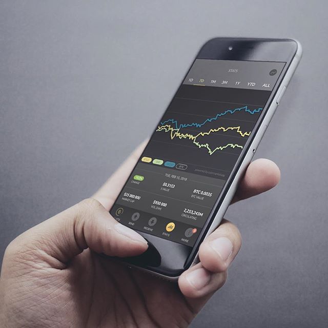
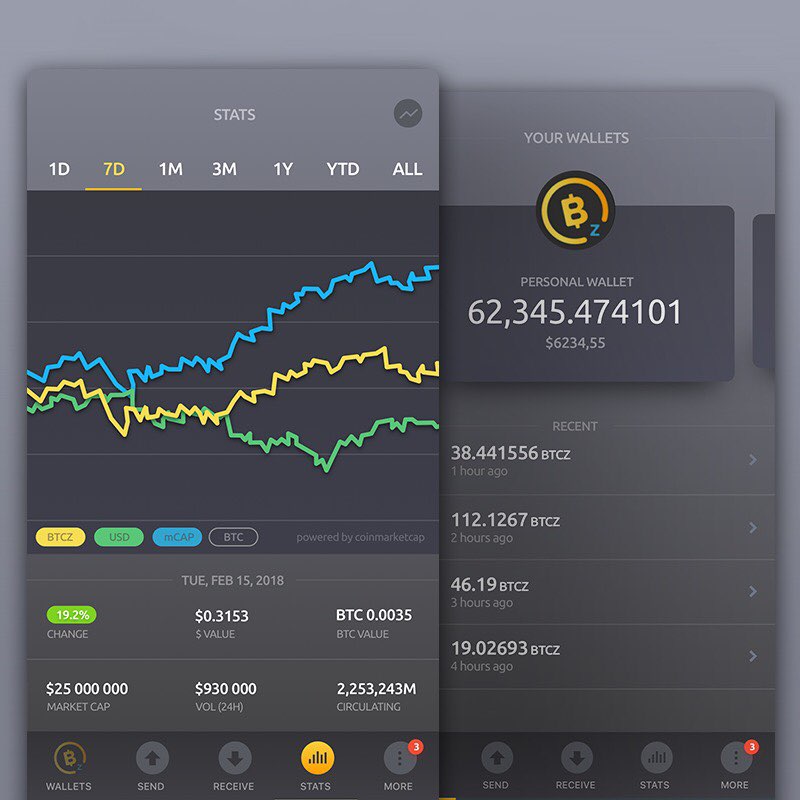
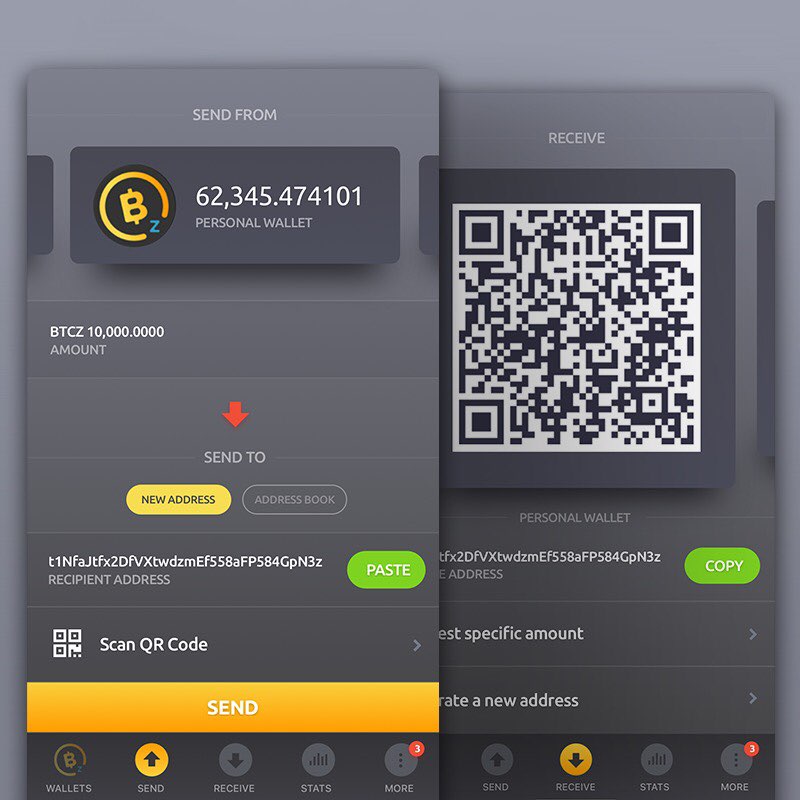
Another idea would be to push the desktop wallet further (aside from fixing it) to make it look a bit more compelling. Wallets that look good also help with trust (I see it with other crypto’s I invest in myself, in most cases those with subpar wallets end up not delivering other things as well). Here are some screenshots of the wallet, but are there any devs that could (with my help and assets cut out) re-code the current swing wallet towards this direction?
Of course for now we can skip STATs , charts and graphs and all that and only “restyle” the current functionalities. The design could be updated if we go with a branding exercise and decide we want lighter colours for example instead of dark grey backgrounds.
- Yes
- No
0 voters
