


^^^
That is good. NewZ lol. Blue font would make it better.

i need couple of days to post mine 

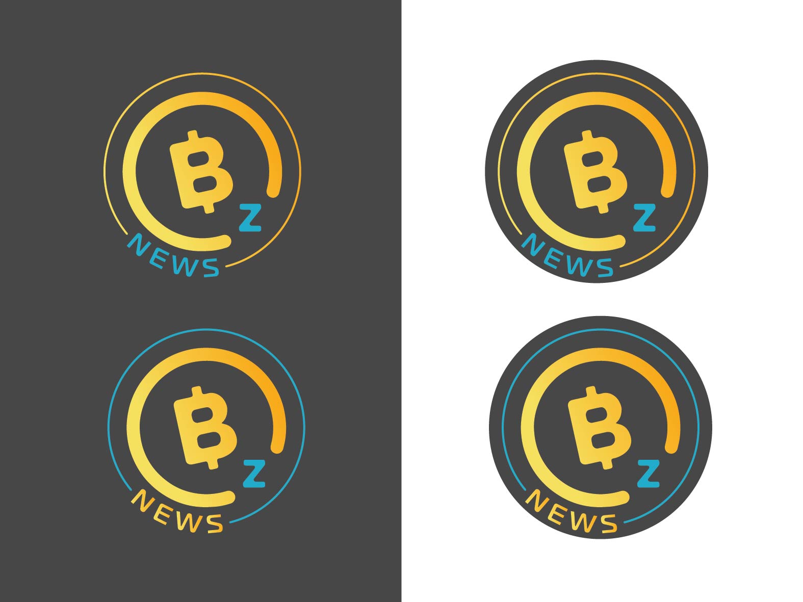
Hey man, below are some reasons for using this logo.
- It’s extremely minimalistic which adds a sense of professionalism/ efficiency
- The Logo itself uses various shades and gives a very artistic yet straight-edged feel
- The linear orientation of the logo makes it feel like a white collar/ professional website/ currency
Hope this suits your needs. Message me here to talk. PS. When do the results come out?
2 Likes


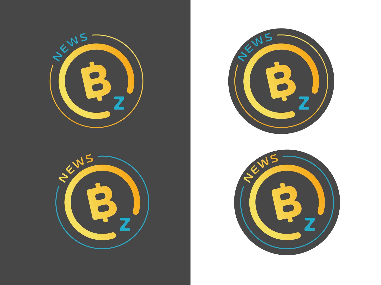
That is pretty cool. But the best part of the BTCZ logo is that it is angled.
1 Like


i think angle is met